CSS
CSS 테두리 스타일 border
하둉이
2022. 10. 2. 03:19
반응형
[CSS 테두리 스타일]
border-style 속성은 표시할 테두리의 종류를 지정합니다 .
dotted- 점선 테두리를 정의합니다.
dashed- 점선 테두리를 정의합니다.
solid- 단색 테두리를 정의합니다.
double- 이중 테두리 정의
groove- 3D 홈 테두리를 정의합니다. 효과는 테두리 색상 값에 따라 다릅니다.
ridge- 3D 융기된 테두리를 정의합니다. 효과는 테두리 색상 값에 따라 다릅니다.
inset- 3D 삽입 테두리를 정의합니다. 효과는 테두리 색상 값에 따라 다릅니다.
outset- 3D 아웃셋 테두리를 정의합니다. 효과는 테두리 색상 값에 따라 다릅니다.
none- 경계를 정의하지 않음
hidden- 숨겨진 테두리를 정의합니다.
코드
<!DOCTYPE html>
<html>
<head>
<style>
  p.dotted {border-style: dotted;}
  p.dashed {border-style: dashed;}
  p.solid {border-style: solid;}
  p.double {border-style: double;}
  p.groove {border-style: groove;}
  p.ridge {border-style: ridge;}
  p.inset {border-style: inset;}
  p.outset {border-style: outset;}
  p.none {border-style: none;}
  p.hidden {border-style: hidden;}
  p.mix {border-style: dotted dashed solid double;}
</style>
</head>

<body>
  <p class="dotted">A dotted border.</p>
  <p class="dashed">A dashed border.</p>
  <p class="solid">A solid border.</p>
  <p class="double">A double border.</p>
  <p class="groove">A groove border.</p>
  <p class="ridge">A ridge border.</p>
  <p class="inset">An inset border.</p>
  <p class="outset">An outset border.</p>
  <p class="none">No border.</p>
  <p class="hidden">A hidden border.</p>
  <p class="mix">A mixed border.</p>
</body>
</html>
결과

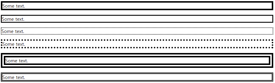
border-width 속성은 네 개의 테두리 너비를 지정합니다 .
: 너비는 특정 크기(px, pt, cm, em 등)로 설정하거나 미리 정의된 세 가지 값(얇음, 중간 또는 두껍게) 중 하나를 사용하여 설정할 수 있습니다.
1~4개의 값을 가질 수 있습니다(위쪽 테두리, 오른쪽 테두리, 아래쪽 테두리 및 왼쪽 테두리)
코드
<!DOCTYPE html>
<html>
<head>
<style>
  p.one {
    border-style: solid;
    border-width: 5px;
  }

  p.two {
    border-style: solid;
    border-width: medium;
  }

  p.three {
    border-style: dotted;
    border-width: 2px;
  }

  p.four {
    border-style: dotted;
    border-width: thick;
  }

  p.five {
    border-style: double;
    border-width: 15px;
  }

  p.six {
    border-style: double;
    border-width: thick;
  }
</style>

</head>
<body>
  <p class="one">Some text.</p>
  <p class="two">Some text.</p>
  <p class="three">Some text.</p>
  <p class="four">Some text.</p>
  <p class="five">Some text.</p>
  <p class="six">Some text.</p>
</body>
</html>
결과
코드
<!DOCTYPE html>
<html>
<head>
<style>
p.one {
border-style: solid;
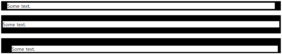
border-width: 5px 20px; /* 5px top and bottom, 20px on the sides */
}
p.two {
border-style: solid;
border-width: 20px 5px; /* 20px top and bottom, 5px on the sides */
}
p.three {
border-style: solid;
border-width: 25px 10px 4px 35px; /* 25px top, 10px right, 4px bottom and 35px left */
}
</style>
</head>
<body>
<p class="one">Some text.</p>
<p class="two">Some text.</p>
<p class="three">Some text.</p>
</body>
</html>
결과
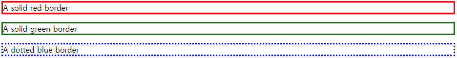
border-color 속성은 네 테두리의 색상을 설정하는 데 사용됩니다 .
코드
<!DOCTYPE html>
<html>
<head>
<style>
  p.one {
    border-style: solid;
    border-color: red;
  }

  p.two {
    border-style: solid;
    border-color: green;
  }

  p.three {
    border-style: dotted;
    border-color: blue;
  }
</style>
</head>
<body>
  <p class="one">A solid red border</p>
  <p class="two">A solid green border</p>
  <p class="three">A dotted blue border</p>
</body>
</html>
결과
코드
<!DOCTYPE html>
<html>
<head>
<style>
  p.one {
    border-style: solid;
    border-color: red green blue yellow; /* red top, green right, blue bottom and yellow left */
  }
</style>

</head>
<body>
	<p class="one">A solid multicolor border</p>
</body>
</html>
결과

코드
<!DOCTYPE html>
<html>
<head>
<style>
body {
text-align: center;
}
/* Four values */
p.four {
border-style: dotted solid double dashed;
}
/* Three values */
p.three {
border-style: dotted solid double;
}
/* Two values */
p.two {
border-style: dotted solid;
}
/* One value */
p.one {
border-style: dotted;
}
</style>
</head>
<body>
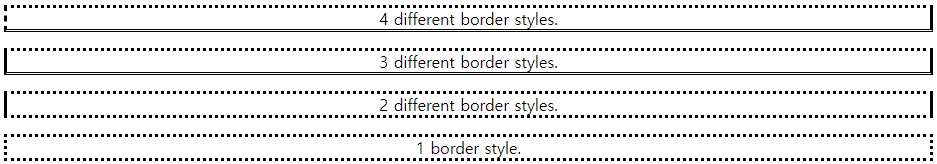
<p class="four">4 different border styles.</p>
<p class="three">3 different border styles.</p>
<p class="two">2 different border styles.</p>
<p class="one">1 border style.</p>
</body>
</html>
결과
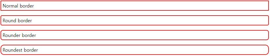
border-radius 속성은 요소에 둥근 테두리를 추가하는 데 사용됩니다 .
코드
<!DOCTYPE html>
<html>
<head>
<style>
  p.normal {
    border: 2px solid red;
    padding: 5px;
  }

  p.round1 {
    border: 2px solid red;
    border-radius: 5px;
    padding: 5px;
  }

  p.round2 {
    border: 2px solid red;
    border-radius: 8px;
    padding: 5px;
  }

  p.round3 {
    border: 2px solid red;
    border-radius: 12px;
    padding: 5px;
  }
</style>
</head>
<body>
  <p class="normal">Normal border</p>
  <p class="round1">Round border</p>
  <p class="round2">Rounder border</p>
  <p class="round3">Roundest border</p>
</body>
</html>
결과
모든 CSS 테두리 속성
| border | Sets all the border properties in one declaration |
| border-bottom | Sets all the bottom border properties in one declaration |
| border-bottom-color | Sets the color of the bottom border |
| border-bottom-style | Sets the style of the bottom border |
| border-bottom-width | Sets the width of the bottom border |
| border-color | Sets the color of the four borders |
| border-left | Sets all the left border properties in one declaration |
| border-left-color | Sets the color of the left border |
| border-left-style | Sets the style of the left border |
| border-left-width | Sets the width of the left border |
| border-radius | Sets all the four border-*-radius properties for rounded corners |
| border-right | Sets all the right border properties in one declaration |
| border-right-color | Sets the color of the right border |
| border-right-style | Sets the style of the right border |
| border-right-width | Sets the width of the right border |
| border-style | Sets the style of the four borders |
| border-top | Sets all the top border properties in one declaration |
| border-top-color | Sets the color of the top border |
| border-top-style | Sets the style of the top border |
| border-top-width | Sets the width of the top border |
| border-width | Sets the width of the four borders |
반응형